Every generation has its share of those who want to impose order on the natural world, to arrange and clarify things. For example, the 1700s saw Linneaus and his taxonomic order for living creatures; today, we say a giraffe is a mammal and a snake is a reptile because over 200 years ago Linneaus drew up his elaborate scheme for classifying everything from mice to eagles. These kind of systems - at least the successful ones - quickly become invisible because they make sense, and they soon become an accepted part of our world view.
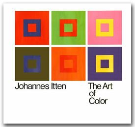
In the mid 1900's, Johannes Itten developed a new kind of color wheel that changed the way color was seen, influencing artists and designers right up to the present moment. The Bauhaus in Weimar, Germany was home to many artists whose influence is still felt today in the worlds of art and design. It was there that Itten developed his book, "The Art of Color," which was the definitive compilation of what was taught in the Basic Course which Itten oversaw, at the Bauhaus.
Itten's color wheel took into consideration the subjective feeling that's associated with objective color, and the psychic and emotional values of colors. Today, we're used to saying that "blue is cold" for example; each time we do, we should perhaps credit Itten and his color theory. "Color is life, for a world without color seems dead. As a flame produces light, light produces color. As intonation lends color to the spoken word, color lends spiritually realized sound to form," he wrote.
Itten was born in Switzlerland, and his first training was not as a painter but rather as a school teacher in Berne, where he learned about psychoanalytic theory. Like that of many artists, his path to becoming a painter was not a straight shot. He enrolled at Ecole des Beaux-Arts in Geneva, but became frustrated with his education there, and returned to Berne. There, he developed an interest in religion and mysticism, and later returned to Geneva to study with Eugene Gilliard, a Swiss painter who was teaching about the geometric elements of art. Itten's early education in geometric elements can be seen throughout his later work, in his interest in the geometry of the color wheel. It was when Itten joined up with other avant-garde artists of the early 1900's in Weimar, Germany, that his diverse interests were able to come together and allow him to create his color theory.
Founded by the architect Henry van de Velde in 1906, the School of Applied Arts in Weimar later drew in Walter Gropius, and from then on the school was known as "Bauhaus." These were the halcyon days of art in Germany, with Kandinsky, Klee, and Itten among the eminent Expressionist painters teaching there. The Bauhaus marked a new moment in art history, cutting through the elaborate, ornate style of the previous era. The designs, in buildings, paintings and sculpture, were simple and functional.
It was under this influence that Itten expanded upon the color wheel developed by Adolf Hozel. Itten took this color wheel another leap forward, inventing a color circle and seven contrasts, and looking at color from every angle philosophic, religious, psychic, psychological and physical.
 |
We know that he's credited with changing the way people see color, but why? First of all, Itten's approach to color theory was revolutionary because he looked at color not only in terms of the physics of how light is absorbed or reflected by matter, and not only in terms of how one color looks when situated beside another. |
Itten looked also at how color affects a person psychology and spiritually; he believed that there were certain characteristics inherent in particular colors that would have a direct influence on how the viewer felt.
At the Bauhaus, Germany's unequalled artists' mecca in the early part of the Twentieth Century, Itten taught his students about color harmony, which to him meant more than simply appreciating colors shown together with similar chromas, or different colors in the same shades. "Harmony implies balance, symmetry of forces," he writes, and goes on to say that such a balance would be expressed when the colors used together would produce not another color (such as when mixing yellow and blue to produce green) but when the colors mixed together produced gray. This was because "medium gray matches the required equilibrium condition of our sense of sight," he writes.
But Itten also discovered that color harmony is quite individual, and that an individual will, if given free reign and a little knowledge, find his or her own "subjective colors." To prove his theory, Itten first taught his students about color in general, and then asked his students to develop their own palette of subjective colors. He found that there was great variety not only in the colors chosen, but also in the ranges of colors. "There are subjective combinations in which one hue dominates quantitatively, all tones having accents of red, or yellow, or blue, or green or violet, so that one is tempted to say that such-and-such person sees the world in a red, yellow or blue light. It is as if he saw everything through tinted spectacles, perhaps with thoughts and feelings correspondingly colored."
In his groundbreaking book, "The Art of Color," Itten essentially gives the color course he gave at the Bauhaus. If you somehow weren't able to make it there, for example, because you weren't even born then, this is the next best thing, as the book begins with Itten's 12-hue color circle, and moves through exercises for the putative student to complete in color combining.
The book also includes 28 color plate reproductions of paintings; in these, Itten points out the use of colors, sometimes in quite surprising ways. For example, in the plate of a section from Apocalypse de Saint Sever by L'Eglise d'Ephese, Itten points out that the red dress of the angel "signifies fiery activity," and the blue and green of St. John, recipient of the angel's message, is "passive."
Itten doesn't limit himself to paintings of the 11th century; in this same section of the book, he looks at Piet Mondrian's Composition from 1928, and finds that the colors used, yellow, red, blue, white and black, each "has its unique character and special weight."
"Mondrian can create a stable equilibrium with a small blue area and a large white area, or intensify the whole with a slender horizontal yellow area at the bottom," he writes. "Great stability and clarity are achieved by dividing the field with broad black lines."
In his color sphere and color star, Itten attempted "to provide a clear and complete map of the world of color." Finding that the 12-hue color circle was insufficient, he went on to develop the color star, a more complicated way of looking at hues and their interactions with one another. But for all his work trying to explain color, the essential mystery of color and its influence on its human cohabitants of the world eluded Itten, and he admitted this.
"If it be imagined that this systematic classification of colors and contrasts banishes all difficulties, I should add that the kingdom of colors has within it multidimensional possibilities only partly to be reduced to simple order. Each individual color is a universe in itself. We must therefore content ourselves with an exposition of fundamentals." Is it any surprise that many of us feel deeply influenced by the colors around us, and have more than one favorite?
"The Art of Color," is published by Wiley Books, and it usually has to be ordered through your local bookstore, as it costs about $100. It is a worthwhile investment if you plan on spending a lot of time studying color, and it is certainly worth looking up at the library.
Sarah Van Arsdale
Copyright © 2002 Sheffield School of Interior Design, 211 East 43rd St. New York, NY 10017, Tel: Fax: , Email:
|